Interior Design
Karl Springer, Innovator
01/September/2015 Filed in: Designers | Antique and Vintage
It's a lamp. A tessellated bone lamp. With the original finial. Okay, now what? Well, now we take a look at one of the most sought after (and imitated) designers of recent memory - Karl Springer. Born in Berlin in 1931 he came to America in the late 1950's with dreams of becoming a famous bookbinder. After gaining a position at Lord and Taylor's his work, and pursuit of quality, was quickly recognized. His hand crafted leather and exotic skin smalls soon caught the eye of a buyer for Bergdorf Goodman and became all the rage (it certainly didn't hurt that the Duchess of Windsor also discovered his fine work...)
Mr. Springer was soon at the head of his own company, producing furniture in a variety of exotic skins, like shagreen - which he helped to bring back into favor, lacquered parchment, metals, bone, faux finishes, veneers and so on. His workmanship was top notch and he constantly sought out new design inspirations - whether from masters like Ruhlman and Frank, or movements like Bauhaus, or peoples like the Ashanti - Karl Springer had an eye to the past and another firmly on the future. And now we come back to the table lamp aforementioned in this post. Hmmm, Karl Springer style or maybe Attributed to or perhaps In the style of... Oh, never mind, what I have is a fantastic homage to a great designer, who - thanks to dealers and imitators, will live on.
This lamp has thin strips of bone veneered to a cylindrical support, a classic nod to one of Mr. Springer's designs. The slender shape of the veneer creates a long, lithe design for the table lamp giving it wonderful presence. With the original, matching finial also veneered in strips of bone - it is a complete look. But Mr. Springer was not the first to create this look... bone, or ivory covered furniture has been with us since the Greek and Roman times.
The ivory covering was reserved for the wealthiest of society. Some examples of their furniture have been preserved because of the eruption of Vesuvius in 79 AD which carbonized some of the furniture, thereby saving it for view until today. The Assyrians were also well versed in the use of ivory to decorate their furniture. The Egyptians, too, decorated their furniture with ivory and examples of it can be found in the British Museum. An interesting note across all cultures is that the ivory that was used on the legs and arms of the furniture often terminated in hoofs and heads of animals. These examples have us travelling back thousands of years. Throughout the Middle Ages and into the Renaissance, one can see examples of bone and ivory covered or inlaid furniture across Europe in Italy, France, Spain, etc and in the East. The Chinese also used ivory extensively in their furniture. And the Anglo-Indian furniture that is still copied to this day is not to be left out. This furniture was inlaid with ivory and bone as well as carved from ivory. The Arab countries too had a version of ivory and bone furniture which is not to be overlooked. The introduction of ivory and bone into and onto furniture and furnishings is a time old tradition.
Mr. Springer certainly gave this tradition a revival and added his own view onto it. By totally covering the surface of furniture and furnishings in bone, and of course goat skin, parchment, shagreen, etc, Mr. Springer created a bold new look that borrowed from ancient history and made it modern.
For the Love of Passion
Can you follow your passion? Can you live a life full of only what you hold dear? Is this possible? Well sure. Sort of. Let's talk about artists. Creators who produce work that is wholly about their passion. Artists who break barriers and cause us to stop and think. Artists who challenge the old guard and what has always been to create what will be. Often times, these artists are not fully appreciated in their own time. So, I ask you - Can you follow your passion or do you have to follow the money?
The idealistic me says that of course you can live a life following your passion. Staying true to what you believe. I do this everyday. The business of antiques and art is my passion. But I am not the creator, I am the dealer. In order for me to be in business there had to have been artists. And they are to whom we owe a great debt. The designers, artists and creators who dared to be themselves. To create for the love of passion.
Brazil in the early 20th Century, I am speaking of the larger more metropolitan cities, was largely influenced by the European and Portuguese tastes. The Colonial style, as it was often referred to, was the dominant taste. Furniture manufacturers employed artisans and craftsman with European training. They created beautiful examples of Louis style furniture in Jacaranda, with caning and other subtle changes that made the furniture perfect for the tropical Brazilian market. And Joaquim Tenreiro was part of this furniture style.
He was employed by one of the largest and most well respected manufacturers of the time. He was using his finely honed European skills to create gorgeous furniture in the European taste. But he was not satisfied. He was earning a living, yes. He was creating furniture, yes. He was following his passion, no. So he struck out and opened his own business. He dared to create a style of furniture that was light, full of grace, simplicity, line, form and function. It beckoned you to sit, to admire, to wonder.
His furniture designs all made use of the indigenous Brazilian woods that are known for not only their beauty, but their strength. And this was also the design behind Joaquim Tenreiro's creations. He met with great success. Opening shops, collaborating with well known architects of the day for their projects - Joaquim Tenreiro was following his passion and earning great respect and admiration. He was pioneering a movement. He was the trailblazer. He was not satisfied.
Sometime in the late 1960's, Tenreiro closed up his shops - retail and manufacturing. He no longer accepted commissions. He would not be making any more furniture. The man who had set a movement in motion and would come to be called the Father of the Brazilian Modernist Design Movement had given it all up. He gave himself over to his art, his painting.
Years pass by. The next wave of designers give Tenreiro much credit and accolades. His designs are touted as the inspiration for a generation of designers. Yet, he remains steadfast to his painting. He created his art, his paintings. But this was done without the same recognition and accolades and purchases that his furniture designs received. He was close to penniless in his later years.
In the end of his life, Tenreiro, the Father of a design movement, was creating birdhouses to pay for his daily living expenses. He died knowing that his furniture designs were important and appreciated, yet he never turned back to them. He stayed with his painting.
Now, maybe the jaded among us will scoff at his loyalty to his passion. But if there is no passion, there can be no art. There can be no design. There can be no creation. Only Joaquim Tenreiro knows the motivation for his choice and surely it is one that only an artist can understand. But, let us look at it another way. Had Mr. Tenreiro continued with his furniture design could he have painted? Could he follow the money and his passion?
Perhaps, yes. Had he continued to produce his furniture, he would have had the income to support his painting. But would his designs have been as inspired? I think the real answer is no. Mr. Tenreiro had no choice. He was an artist and had to follow his passion. And he did find a way to support himself and to continue to follow his passion. Maybe we, because of the nature of the antiques and art business, put too much emphasis on money. Should it be said that we follow the money and artists follow their passion?
And now to further complicate the issue, can there be art without money? If artists' work never reached the secondary market, how could they continue to produce. Surely there must be those willing to purchase the work? How else can art continue? Such a tangled web.
Mr. Tenreiro's furniture now sells for tens of thousands of dollars at both auction and for even more in retail galleries. Because he only produced for a relatively short period of time, his furniture pieces are more difficult to find. And this same rarity can be said of his paintings, but for another reason. Because they were not as much in demand, they did not come to the secondary market as frequently. Perhaps now too his art will receive the same attention from buyers as he had given it all those many years ago. Maybe the money will learn to follow the passion.
How the Furniture Industry can Save Antiques
01/November/2015 Filed in: Antique and Vintage | Designers
It was a few years ago that found me feverishly buying and packing for an upcoming show. A show I had never been to because I always thought it was only for new furniture. Perish the thought, I would say. Who needs something new when there are so many incredible antique and vintage options. I'll tell you who needs new furniture: Interior Designers. They need something to fit in a certain space, in a certain fabric, in a certain time frame and in a certain budget. Could these folks really embrace the world of antique and vintage furnishings? A world of uncertainty. A world where luck played as big a role as experience? A world where things could not be ordered, did not come in six colors and could not be custom sized? Yes. And boy did they...
With my rental truck packed to the ceiling, I headed south to High Point, NC. The furniture capital of the world. New furniture that is. For nine hours I pondered my choice to sign up for this show. Too late to turn around, I journeyed onward. Arriving at the refurbished former factory building, now showroom, I knew this would be a great show. As I unpacked, the buzz grew. Sure, I expected other dealers to be interested, but when I saw groups of Interior Designers strolling through I knew this was something special. The sales began in earnest and stayed strong throughout the week. Designers were choosing pieces for their projects and fawning over my antique and vintage finds. They looked at the seating, lighting and case goods in my booth with fresh eyes and saw potential in every piece. They had become the champions of the antiques business.
Because, for a long time now, the word antiques conjured up a dusty, dank, cramped type of feeling where brown wood is stacked on top of more brown wood. Not exactly the stuff of million dollar renovations. But, it is now. Folks are falling in love with antique and vintage pieces all over again. They are learning how to live with them, decorate with them, incorporate them into the design of their homes. Top designers command their own shows and have reached celebrity status. Oh yes, I know this is not truly new. The icons of earlier generations certainly paved the way, but now we are reaching far more folks. Antique and vintage pieces are no longer reserved for the few, but for the many. It's now quite the norm to see these antique and vintage pieces in homes. And that's because they've been made accessible.
Decorative pieces, even designer pieces, are now de rigueur for interiors. They add a touch of uniqueness, of personality, of history. You see, there is always a great story behind every antique and vintage piece. Whether you tracked it down in a grassy out door flea market field or traipsed through 100's of showrooms - there is always a story. This makes for great conversation in the home as well. Guests will marvel at your (your interior designer's) skill at unearthing such incredible finds.
Are You Single?
01/December/2015 Filed in: Antique and Vintage | Interiors
Have you heard that? Have you said that? I'm not speaking about dating, but rather singles and pairs in the antiques and design business. Lamps, chairs, vases, chandeliers, mirrors, sconces - just about anything. For those of us in the antiques and design business we seem to be all too preoccupied by pairs. The desire to have a mirror copy of a room, to have even numbers throughout, to have a numerical balance - it just doesn't add up.
Let's examine your living room. A sofa with a matched pair of end tables on either side with a matched pair of lamps or vases sitting on top. There's a coffee table with a matched pair of something or other on top. Then there's a matched pair of ottomans or chairs on the other side of the coffee table. That's a lot of twos. Then of course, there's the console table with a matched pair of lamps or vases on top and the list goes on. Is having two of something really that much better?
Now, let's back track a bit to how those pieces came to be in your living room. Perhaps you chose them, or your designer. In either case you had to shop. Surely you (or your designer) were out in the market looking for those 'just right pieces' and you came across something perfect. You then asked the seller the price. It was a great deal, it seemed almost too good to be true. Then you realized that it was a single and your hopes were smashed to pieces (a lot more than two I might add). You explain to the seller that you would have bought it if it was a pair. The seller then thinks to himself (or verbalizes if he doesn't want any future business with you) that it wouldn't be that price if it were a pair and is happy to see you move on. So on you go looking for that perfect pair of something with just the right scale and color to complement the sofa. But, please tell me, why does there have to be two of everything?
Sets of dishes and chairs are always in even numbers assuming that everyone who eats or sits in your house is one of a pair. Don't you know any single friends? Apparently our design theory is based on a very simple belief that in order to be something desirable, there must be two. And an exact two. Doesn't that make things a bit redundant in your home? Kind of like only decorating half of your home and then just placing and exact copy on the other side of the room? Seems a bit lazy to me. Why not simply install a floor to ceiling and wall to wall mirror? This will alleviate the problems of finding furnishings in pairs. And it could save you a lot of money in the long run. There's another bonus too, you'll always have someone to talk with! Maybe I'm getting a bit farfetched, so let's get back to the topic.
Symmetry is defined as the quality of being made up of exactly similar parts facing each other. Wow. Sounds sterile. So, let's find out what asymmetry is. It is the lack or absence of balance between the shapes of a thing. Wow. Sounds uncomfortable. I think that we need to rewrite those definitions as they pertain to the antiques and design business. It is just fine to have a sofa with only one end table and one table lamp. This will leave you plenty of room on the other side of the sofa for a floor lamp. Now, both sides are well lit and you still have a place to set down your book. Sitting across from the coffee table, you'll want to have plenty of seating for friends. A long bench or a chaise is a wonderful alternative to pairs of ottomans or chairs. It will also encourage your guests to sit right next to each other! Take a walk through your home and count up the number of pairs, you're sure to use all your fingers and maybe even your toes if your house is large enough. Now, imagine the difference if you'd remove those doubles. Your first inclination may be that your house will be out of balance. No, don't listen. Balance does not equal exact copy. Balance is the way to keep a flow through your home, balance is harmony. There is nothing limiting you to balancing only with an exact replica.
Now imagine the freedom of the dealers in the marketplace. They would no longer be afraid to purchase for resale single items. A great chair. A great lamp. A great vase. And so on. They would have the confidence to buy great items no matter the number. Odd numbers rejoice! For there will be a long line of customers looking for that just right single piece. You may ask how I incorporate this new found freedom into my inventory. Have I been immune to twins? As I must be forthright, I too, have fallen victim to this. I have seen great single items and hesitated to purchase thinking whether or not I'd be able to sell them. I have had pairs of items that I did not want to break up after receiving an offer to purchase only one. Obviously those dealers and buyers were already well aware of the odd number theory. So, how to manage being in business, which does of course require catering to your clients' taste and keeping individuality in your inventory? Join the best of both worlds.
Single vs Pair. Where do I stand you ask? Smack in the middle. I have an all together different requirement for my buying - my inventory often consists of items that are either ridiculously heavy or ridiculously large. They really say something. And I am a firm believer in making a statement. So, let me be the first to say, "Break up!". Get out of your comfort zone and try putting a little unbalance in your balance. You may just find that it opens you up to a whole new world of amazing decor!
Selling a Table to Thom
01/December/2016 Filed in: Designers
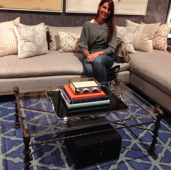
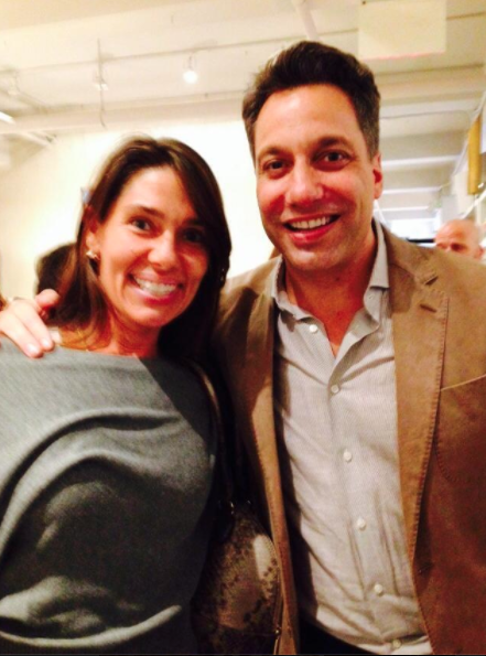
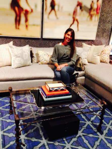
As in Filicia. Seriously. I was set up at an antique show in North Carolina. When he and his team strolled down the aisle directly in front of my booth. I was eyeing them from the back corner of my booth, not wanting to jump on them but making sure that I was available if they had any questions. There was only one… can you get this delivered to us in New York? So, let me backtrack a bit and tell you the story of how I purchased this amazing table. At the time I was living in Philadelphia and was out shopping specifically for the show. I had stopped by one of my favorite pickers as he was pulling up to his warehouse. I quickly parked my SUV and jumped out, making a bee line for his pick up truck. Peering in I saw a wrought iron foot of the table and it was stamped 'Made Italy'. In my book, that's always a good sign. I quickly priced and purchased the table without even seeing the rest of it. Immediately, I rummaged through the rest of his finds and purchased the lot of them. Days shopping accomplished in under fifteen minutes! And the table you ask? Well, it's currently in his Sedgwick and Brattle showroom in the New York Design Center. Lisa Mende even blogged about it, click here to see. Here's a pic, or three…


Ron Marvin and the Ferry Ride on TV
01/November/2016 Filed in: Designers
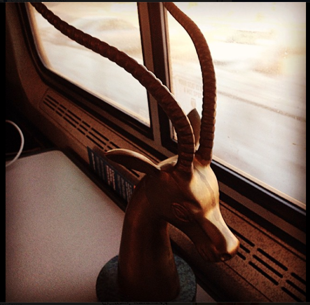
When my friend Ron Marvin, a New York City based interior designer, reached out to me and asked if I would donate to his Design on a Dime vignette for Housing Works thrift shops I said Yes immediately. Ron is a terrific friend and Housing Works does great work. It's a win-win. I needed to get the vintage brass antelope sculpture mounted on a marble base to him. And quickly. At this time I was living in Massachusetts and tt just so happened that I was heading to NYC for the weekend. With an overnight bag on my shoulder and a big sculpture in my arms I hopped in a taxi to the waterfront to take the ferry to the train station in Boston. Anyone else thinking trains, planes and automobiles? It was the almost end of the Winter of 2014 - 2015 and folks on the South Shore were still digging out from a record snowfall of about 10 feet. There was a TV news crew on the ferry who were interviewing folks about their commute and giving away free coffee and donuts as a way to say, 'hold on - Spring is around the corner'. As you can imagine, the early morning ferry full of commuters were less than enthused about the camera crew, the giddy news reporter or even the coffee for that matter. They had all endured a brutal Winter of long commutes, delayed transportation and slippery floors. But, I on the other hand, was equally as giddy as the reporter and more than happy to be interviewed on live morning TV. I think it was the antelope that got his attention! We chatted, the camera recorded and the news reporters in the studio were equally as fascinated with the antelope. I 'may' have said that I brought it everywhere with me… No, just kidding. I shared how it was being donated to a charitable event in NYC through Ron's beautiful design. Another win-win. Funny story for morning TV and a nice plug for the event. The remainder of the trip, this leg by train, was uneventful in so far as news crews, but I did have some great conversations! Here's a pic of Ron's Design on a Dime vignette:
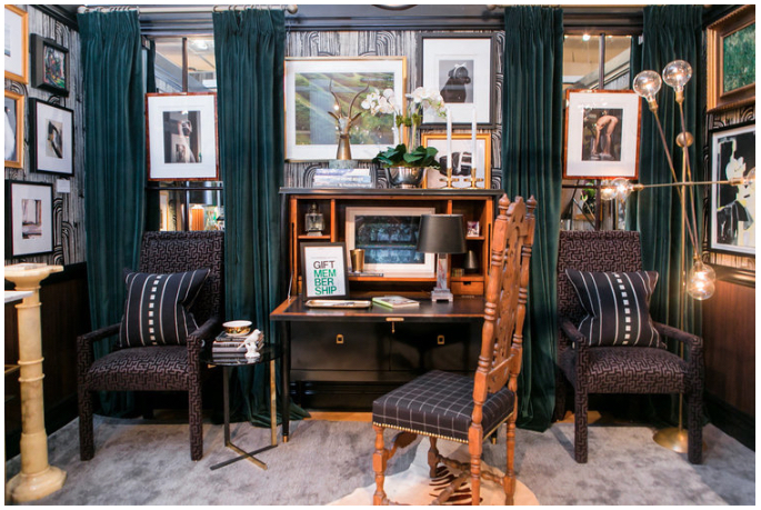
The antelope is placed on top of a stack of books on top of the fall front desk. Of course the vignette was a sell out and a huge fundraiser for Housing Works. I'm so happy that Ron asked me to participate!
Here are a couple fun pics of the commute…

The antelope is placed on top of a stack of books on top of the fall front desk. Of course the vignette was a sell out and a huge fundraiser for Housing Works. I'm so happy that Ron asked me to participate!
Here are a couple fun pics of the commute…


Kelli Ellis and Universal Furniture
01/October/2016 Filed in: Designers
Kelli and I first met in Las Vegas when I was chosen to be a tour guide for her Design Campus tour at Las Vegas Market. I was blown away by her generosity and exuberance. Kelli definitely has a magnetic personalty. Fast forward to April 2016 when I bumped into Kelli at an antiques show. She was debuting a line of furniture of her own design at Universal Furniture and wanted a few accessory and art pieces to jazz up the showroom. Of course I jumped at the chance. This market I was debuting the Modern Look Book concept and Kelli absolutely loved the oil paintings by New York City based artist Clintel Steed as well as the black and white street photography by Philadelphia based photographer Michael Penn. Kelli chose two works from each artist along with a selection of vintage brass tabletop accessories. The showroom looked great. Here are a few pics…
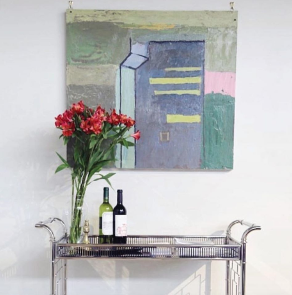
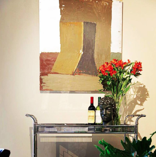
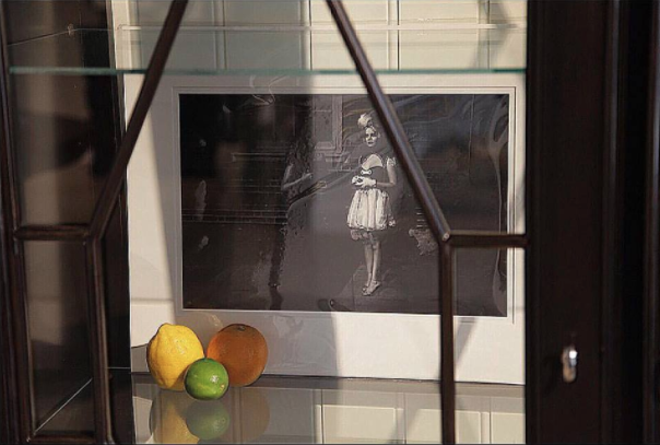


Tyler Hays of BDDW
01/September/2016 Filed in: Designers
I first met Tyler when I was living in Philadelphia and had opened up a small shop in the Fishtown neighborhood on Frankford Avenue. Tyler had a massive studio in Philadelphia and would often park his car near my shop when he and his team would go for lunch. It was on one of those lunch outings that he saw the oversized antique hand painted murals hanging in my storefront windows. A few days prior I had been sourcing vintage industrial pieces and came upon the murals. They had been cast aside, rolled up and left on a cold and damp concrete floor. Not seeing the images, but understanding the scale, I quickly scooped them up and hoisted each onto my shoulder and into my rental truck. There were a lot of trips to the truck that day! Arriving back at my shop I couldn't wait to unroll the murals to see what was on them. To my great delight I saw the scenes - nature scenes, animal scenes, fishing scenes - they were stunning. And Tyler thought so too. Understanding their importance, Tyler purchased the entire collection. They now decorate his New York City and Milan showrooms. Here are a few pics…
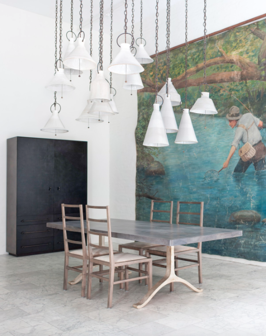
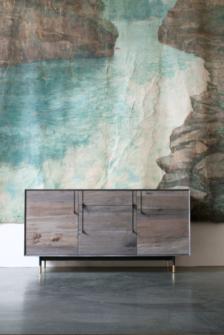
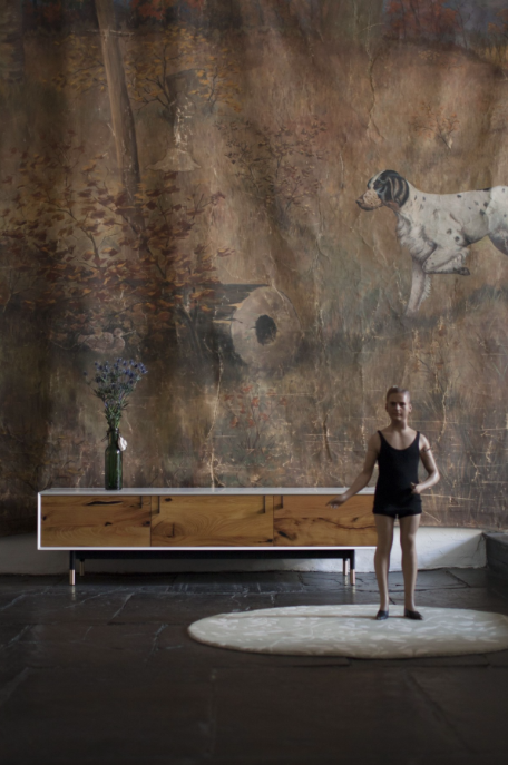
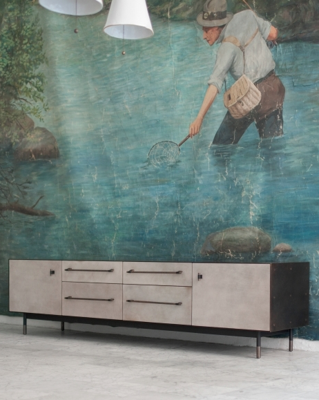
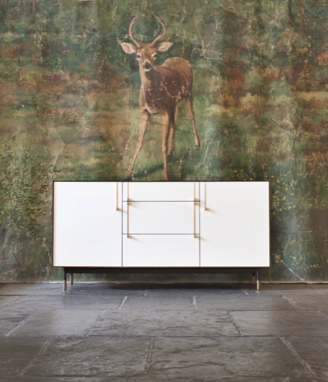
Holiday House NYC 2014
01/January/2016 Filed in: Designers | Showhouses
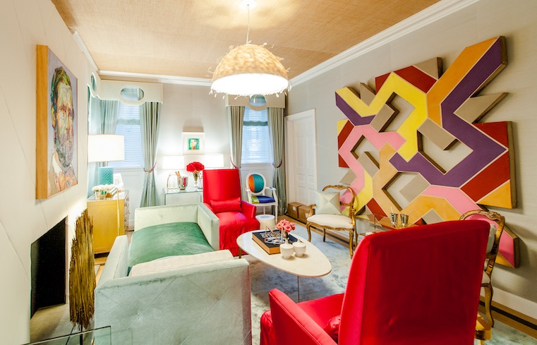
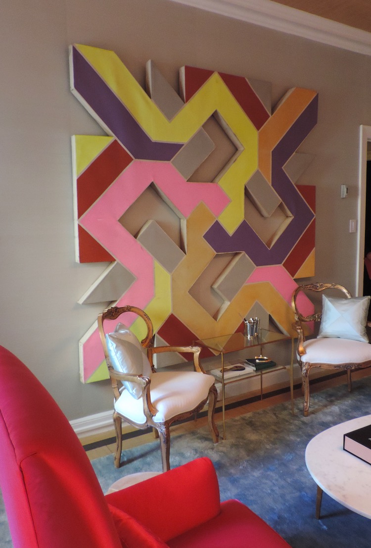
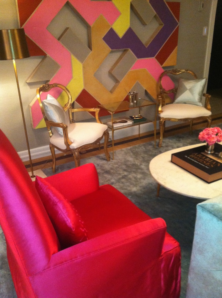
It was a little over two years ago that I met New York City based interior designer Patrick Hamilton. I was attending a dinner hosted by Massachusetts based talent agents Fashion+Decor and had the pleasure of sitting in between Iris Dankner, the founder of Holiday House and breast cancer survivor, and Patrick Hamilton, a returning alumnus of Holiday House. Talk about lucky! We had a fabulous dinner and wonderful conversation. It was a pleasure to learn about Holiday House. It was then that our conversation turned to business when Patrick asked if I had anything horse related in inventory. Grabbing for my phone, I scrolled through image after image of items - a tole rose trellis coffee table, a Tang style Chinese horse lamp, a Mexican steel wall sculpture of Polo players - but none fit the bill. I was determined though to show Patrick something that he would like. And then it hit me, a couple weeks prior I had purchased an oversized vintage abstract shaped canvas painting that had the color scheme of the silks worn by jockeys. Wanting to make a big impression, I presented the image with a great deal of fanfare and it was met with a resounding yes! A month or so after the dinner, I rented a truck and drove the painting from Massachusetts to New York City. Patrick's room, a take on the Kentucky Derby called Derby Deconstructed was a huge hit. I was honored to be part of it! Here are a few pics…
Southern Style Now Showhouse
01/August/2016 Filed in: Designers | Showhouses
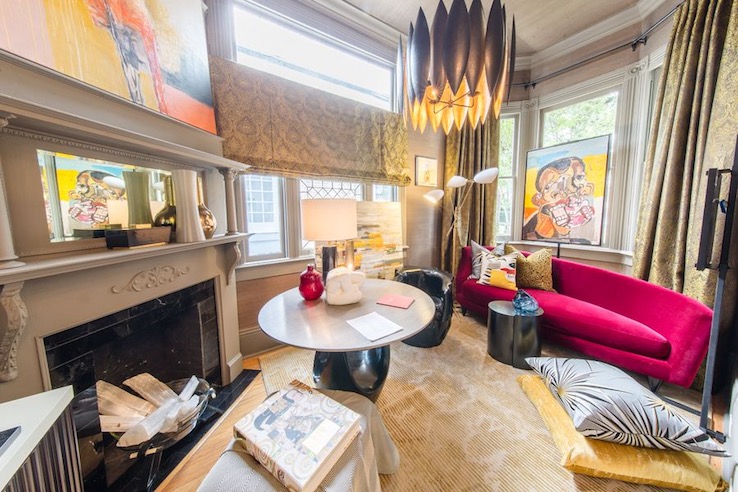
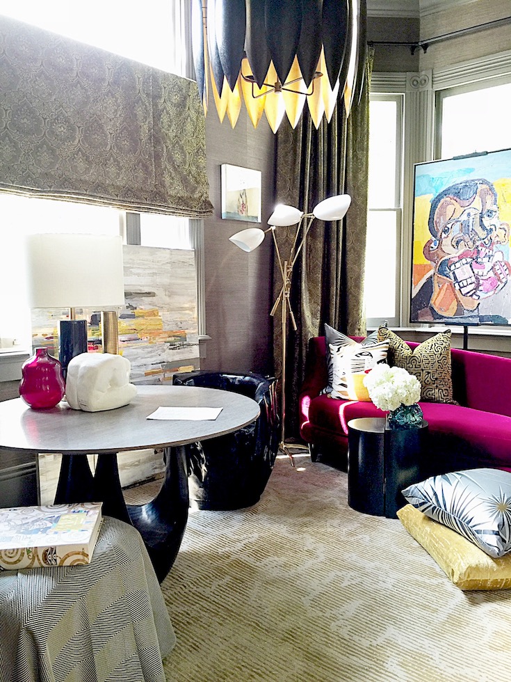
Michel Smith Boyd, Atlanta and New York City based interior designer, and I first met in Las Vegas at a trade conference. We became fast friends as I immediately gravitated to his warm personality and his strong taste in interiors. Fast forward to April of 2016 when we saw each other again at an antique show where I had debuted the Modern Look Book concept. Michel was captivated by the contemporary oil paintings by New York City based artist Clintel Steed. Michel was sourcing a few finishing touches for the first floor den at the inaugural Southern Style Now Showhouse in New Orleans. He selected 'Birthday Self Portrait' by Clintel Steed and it was shipped to the shophouse the following day. His room generated fantastic reviews. Here are a couple pics…
Christopher Kennedy Showhouse
01/July/2016 Filed in: Designers | Showhouses
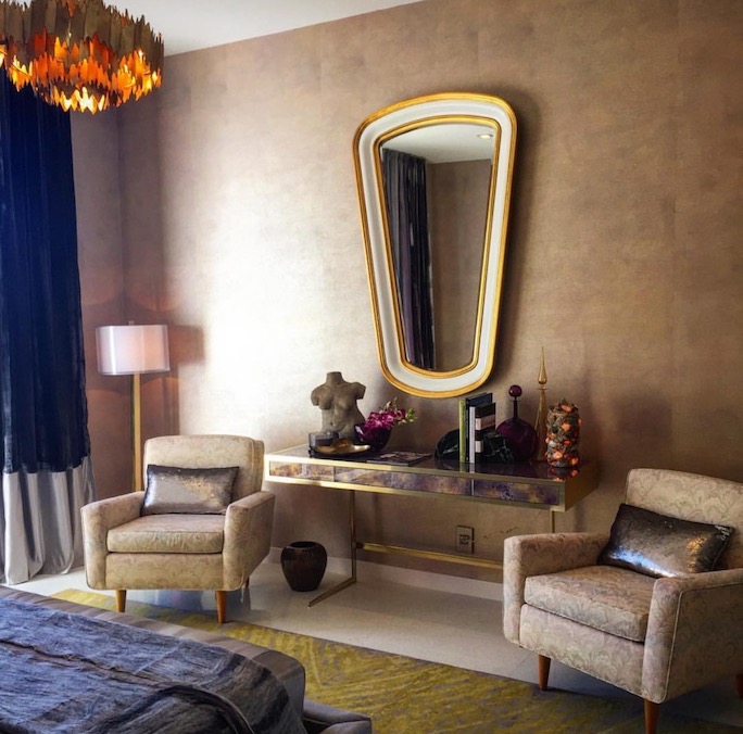
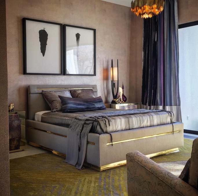
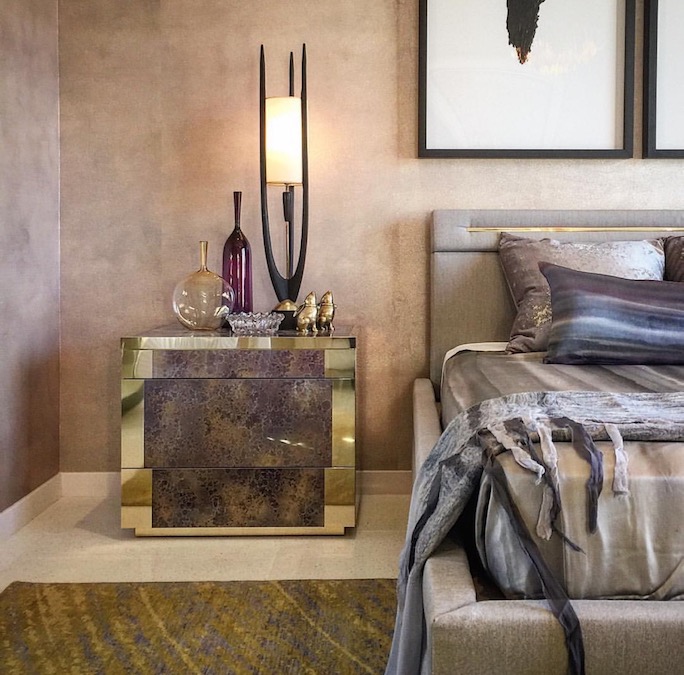
When Justin Shaulis, New York City based interior designer and trained architect, approached me with the idea to assist him in sourcing vintage pieces for a showhouse I jumped at the chance. Justin and I first met through shared social media contacts so when we finally met face to face IRL (in real life) it looked as though we had been friends forever. Case in point: Justin posted a pic of the two of us to his Facebook page and with a couple minutes received a call from him Mom asking why she had never heard of me! Sometimes you really do click with people. That was why I knew I'd be successful in understanding Justin's vision for the Guest Suite at the Christopher Kennedy Compound Palm Springs Showhouse, February 2016. At the time, I was living on the South Shore of Boston and had lucked into a few mid century homes. I sourced a pair of original Florence Knoll armchairs, a pair of Modeline table lamps, various brass accessories, a concrete torso sculpture and a pair of rock crystal and quartz decorated table lamps. The shopping was intense and I knew there was a deadline. We made it, just down to the wire with the shipper, and Justin installed everything in the Guest Suite to rave reviews. Here are a few pics…
