A Time to Remember
Show Houses a Plenty
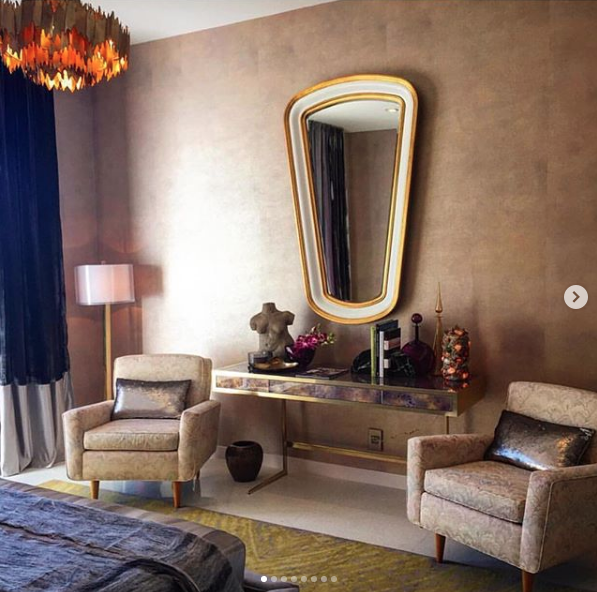
Justin Shaulis - Christopher Kennedy Palm Springs Show House
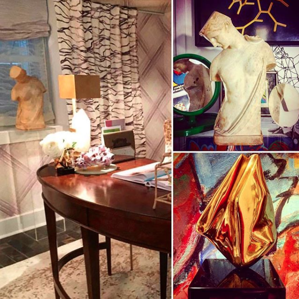
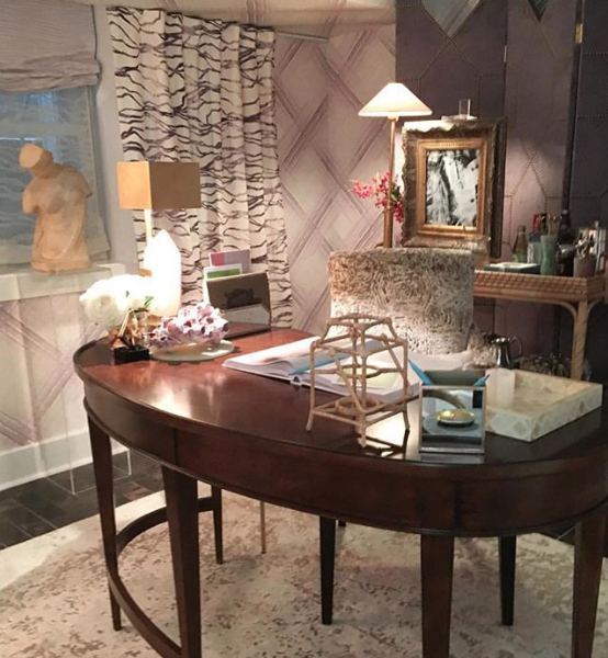
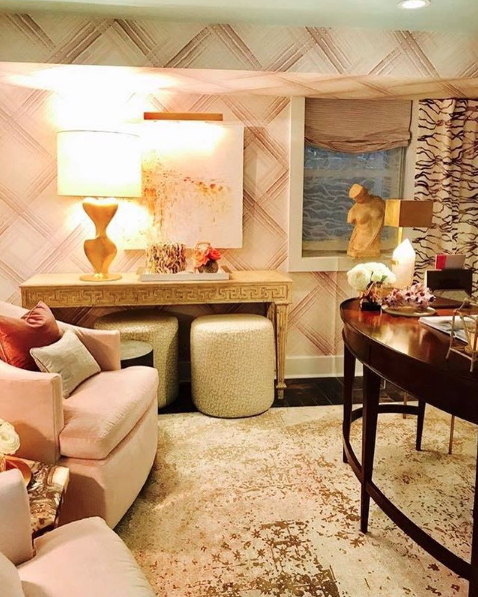
Florence Knoll armchairs, Vintage concrete torso sculpture, One of a pair of rock / stone / quartz / crystal lamps, Vintage brass floor lamp,
Vintage brass vase, Vintage brass accessories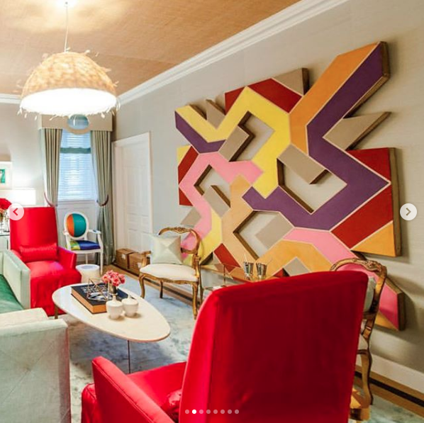
Patrick Hamilton - Holiday House New York City Show House
Vintage 1970's shaped canvas abstract painting by Sidney Guberman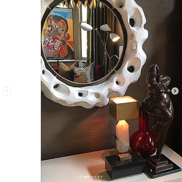
Michel Smith Boyd - Southern Style Now New Orleans Show House
Contemporary portrait painting by Clintel Steed
Paolo Moschino / Philip Vergeylen - Nicholas Haslam London Showroom
One of a pair of vintage Gabriella Crespi style split reed bamboo side tables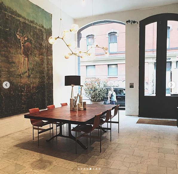
Tyler Hays - BDDW New York City Showroom
One of fourteen antique hand painted oversize mural paintings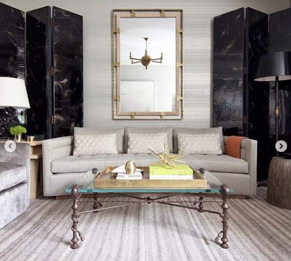
Thom Filicia - Sedgwick & Brattle New York City Showroom
Vintage cast iron sculptural coffee table with custom lucite top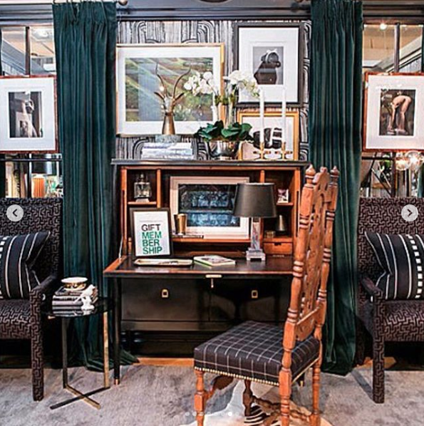
Ron Marvin - Design on a Dime New York City Housing Works Showroom
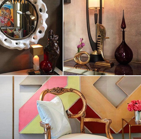
Vintage brass sculptural antelope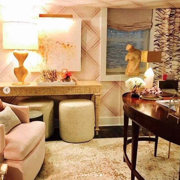
Patrick Hamilton - Southern Style Now Savannah Show House
19th Century marble sculpture of Psyche, Vintage abstract gilt bronze sculpture
House Proud, House Beautiful
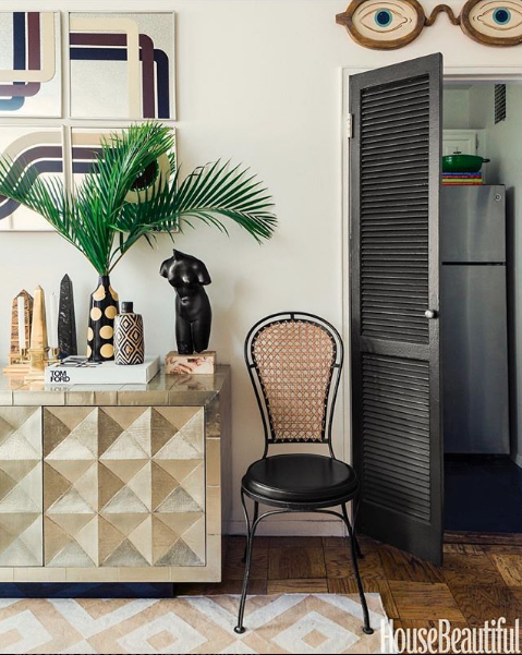
PHL – BOS – GSO – LHR
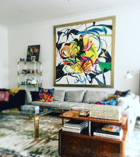
Contemporary Traditions

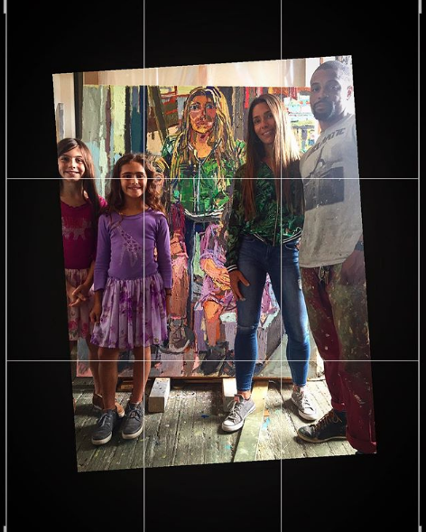
Southern Charm
Three's a Magic Number
Are You Single?
Let's examine your living room. A sofa with a matched pair of end tables on either side with a matched pair of lamps or vases sitting on top. There's a coffee table with a matched pair of something or other on top. Then there's a matched pair of ottomans or chairs on the other side of the coffee table. That's a lot of twos. Then of course, there's the console table with a matched pair of lamps or vases on top and the list goes on. Is having two of something really that much better?
Now, let's back track a bit to how those pieces came to be in your living room. Perhaps you chose them, or your designer. In either case you had to shop. Surely you (or your designer) were out in the market looking for those 'just right pieces' and you came across something perfect. You then asked the seller the price. It was a great deal, it seemed almost too good to be true. Then you realized that it was a single and your hopes were smashed to pieces (a lot more than two I might add). You explain to the seller that you would have bought it if it was a pair. The seller then thinks to himself (or verbalizes if he doesn't want any future business with you) that it wouldn't be that price if it were a pair and is happy to see you move on. So on you go looking for that perfect pair of something with just the right scale and color to complement the sofa. But, please tell me, why does there have to be two of everything?
Sets of dishes and chairs are always in even numbers assuming that everyone who eats or sits in your house is one of a pair. Don't you know any single friends? Apparently our design theory is based on a very simple belief that in order to be something desirable, there must be two. And an exact two. Doesn't that make things a bit redundant in your home? Kind of like only decorating half of your home and then just placing and exact copy on the other side of the room? Seems a bit lazy to me. Why not simply install a floor to ceiling and wall to wall mirror? This will alleviate the problems of finding furnishings in pairs. And it could save you a lot of money in the long run. There's another bonus too, you'll always have someone to talk with! Maybe I'm getting a bit farfetched, so let's get back to the topic.
Symmetry is defined as the quality of being made up of exactly similar parts facing each other. Wow. Sounds sterile. So, let's find out what asymmetry is. It is the lack or absence of balance between the shapes of a thing. Wow. Sounds uncomfortable. I think that we need to rewrite those definitions as they pertain to the antiques and design business. It is just fine to have a sofa with only one end table and one table lamp. This will leave you plenty of room on the other side of the sofa for a floor lamp. Now, both sides are well lit and you still have a place to set down your book. Sitting across from the coffee table, you'll want to have plenty of seating for friends. A long bench or a chaise is a wonderful alternative to pairs of ottomans or chairs. It will also encourage your guests to sit right next to each other! Take a walk through your home and count up the number of pairs, you're sure to use all your fingers and maybe even your toes if your house is large enough. Now, imagine the difference if you'd remove those doubles. Your first inclination may be that your house will be out of balance. No, don't listen. Balance does not equal exact copy. Balance is the way to keep a flow through your home, balance is harmony. There is nothing limiting you to balancing only with an exact replica.
Now imagine the freedom of the dealers in the marketplace. They would no longer be afraid to purchase for resale single items. A great chair. A great lamp. A great vase. And so on. They would have the confidence to buy great items no matter the number. Odd numbers rejoice! For there will be a long line of customers looking for that just right single piece. You may ask how I incorporate this new found freedom into my inventory. Have I been immune to twins? As I must be forthright, I too, have fallen victim to this. I have seen great single items and hesitated to purchase thinking whether or not I'd be able to sell them. I have had pairs of items that I did not want to break up after receiving an offer to purchase only one. Obviously those dealers and buyers were already well aware of the odd number theory. So, how to manage being in business, which does of course require catering to your clients' taste and keeping individuality in your inventory? Join the best of both worlds.
Single vs Pair. Where do I stand you ask? Smack in the middle. I have an all together different requirement for my buying - my inventory often consists of items that are either ridiculously heavy or ridiculously large. They really say something. And I am a firm believer in making a statement. So, let me be the first to say, "Break up!". Get out of your comfort zone and try putting a little unbalance in your balance. You may just find that it opens you up to a whole new world of amazing decor!